Printing Inks Used On The 1967-1973 Centennial Issue - Part One of Eight
Today's post will delve into another aspect of the Centennial issue, that I feel has received less attention than it should: the printing inks. Apart from the fluorescent orange ink variety of the 6c orange, scarcely any attention is given in Unitrade to the immense variations in ink that can be found on this issue. In discussing the inks used, it is necessary to distinguish between how the inks will appear in normal light, and how they appear under ultraviolet light. In Canadian philately, the long-wave ultraviolet light (UV) is used to study modern issues, as it is this end of the spectrum to which the inks and tagging react the most. This is the safer wavelength of ultraviolet light as well, and is commonly referred to by laypeople as "black light". It is possible that two inks that appear the same in normal light or long wave ultraviolet light, might appear different under short-wave ultraviolet light. However, due to the dangerous nature of this type of light and the fact that it has not generally been in widespread us for Canadian stamps, I have not taken the study of inks in this direction. However, it may well be one worth exploring. What is certain, and will become apparent is that there are many, many instances where two stamps will have almost the same appearance under normal light, but whose inks will appear wildly different under UV light.
Thus, it is logical for me to tackle the issue of printing ink in eight posts: four dealing with variations between the inks in normal light, and another four to deal with variations under UV light. Today's post will look at the variations that are apparent under normal lighting conditions for the 1c, 2c, 3c and 4c. Then, over the next three weeks, I will look at the shades for the other values. Then after that, I will do the same thing, but looking at the differences under UV light. It is strange to me that no shade variations are listed in Unitrade for this issue. Although the differences between the colours of the stamps are generally subtle at first glance, once you become highly familiar with the stamps, you will begin to see that many of them look significantly different from one another. For the CBN printings. those stamps printed on paper with PVA gum tend to printed in colours which on the whole are both brighter and fresher than the earlier Dex gum printings, which are deeper and duller. The dex gum stamps on dead coated paper are the deepest of all, and it is this fact that provides some way to identify these printings, even when one does not have access to a UV lamp. The CBN booklet and cello paq stamps tend to exhibit many of the same shades found on the corresponding sheet stamps, but such is not the case with the BABN booklet stamps, which are often completely different colours from their sheet counterparts. The biggest discrepancies between booklet and sheet stamps occur on the 1c, 3c, 4c, and 5c booklet stamps, through it must be emphasized that the BABN did not print any of these stamps in sheet form, all that printing being done by the CBN. So, for those stamps, the point of comparison is between two printing firms. However, even with the 6c orange, 6c black, 7c emerald and 8c slate, there are colours on some of the sheet stamps that one does not find replicated in the booklet stamps and vice versa.
Shade variations can be found on virtually every value in the set, and the remainder of this post will look at each of these in turn.
1c Brown - Northern Lights and Dog Sled Team
The basic colour of this stamp varies, depending on whether or not it comes from a sheet or a booklet, and depending on who printed it.
CBN Sheet Stamps And Booklet Stamps
The basic colour of most of the CBN sheet stamps and booklet stamps is deep brown on the Stanley Gibbons colour key. The colour somewhat chocolaty without having either an overly reddish or purple undertone. Some of the early printings were also a very deep and slightly blackish brown, which is often thought of as purple brown, but actually isn't. However, by and large, the colour began to acquire more and more of a reddish undertone, so that by the time the general tagged PVA gum stamps appear from plate 5, the colour is a full-on red brown.
The following scan shows the basic range of shades found with the sheet stamps:

On the top row we have the basic shades of deep brown (all dex gum), with the blackish brown on the right, the pure deep brown on the left and a chocolate brown in the middle. The middle row shows three PVA gum printings that show the red-browns. The untagged and general Ottawa OP-2 tagged stamps on the left and right are a very close match to Gibbons's red-brown, while the centre Winnipeg tagged stamp is a close match to Gibbons' reddish brown. The bottom row shows two printings, one with dex gum on hibrite paper and one with General Ottawa OP-2 tagging and PVA gum. These two stamps have a brown that can best be described as being mid way between the colour palette of the top two rows. The left stamp is an exact match to Gibbons's chocolate, and is just a touch brighter than the centre stamp in the top row. The stamp on the right is similar to the Winnipeg tagged stamp above it, but there is just a little less red in it, and just a wee bit more brown. But if someone were to sort these quickly, they would probably miss the distinction and say that this, and the stamp above it were the same shade.
Now, let's take a closer look at each of these rows:


Again, the end stamps should look quite similar here, and definitely reddish, while the centre stamp looks distinctly browner than the other two. I have not yet seen any booklet stamp printed in any of these shades. That is not to say that none exist, or existed, but just I haven't seen them.

In this scan these two stamps look similar, but if you let your eyes adjust, the one on the right has a purple undertone and is duller than the one on the left, which looks redder and browner by comparison.
Booklet Stamps - Nearly All BABN
The BABN booklet stamps are another range of shades entirely from the ones shown above. They are all closest to chocolate and purple-brown on the Gibbons colour key, with varying degrees of red, or purple in the colour. They lack the bright red of the reddish and red browns, and the blackish undertone of the deep brown. They are all somewhat dull in their appearance as well. I have not seen any of these shades replicated in the sheet stamps.
The following scan shows a range of BABN booklet stamps, with a CBN booklet stamp on the right side of the upper row for comparison. The CBN stamp is the basic deep brown, and it highlights how different the BABN shades are from the CBN ones. Let's take a look at them:

The second stamp from the left in the top row is closest to Gibbon's chocolate, but is deeper. The stamp to the left of it is very similar, but has a bit of a purple undertone. That stamp on white paper with white, shiny PVA gum, while the second stamp from the left is with the type 1 high gloss dex gum. The third stamp with the perf 10, and high gloss dex gum, which I believe comes from the 1c+4c booklets is also a very close match to deep chocolate with a strong purple undertone as well.
On the bottom row, the perf 10 stamp with label, which has the type 2 lower gloss, satin dex gum, which comes from the 25c booklets is almost a perfect match to Gibbons' purple brown. Finally, the perf. 12.5 x 12 1c on the right, which is on ribbed paper with cream eggshell PVA, which comes from the 25c booklets from 1971, is a very close match to the perf 10 stamp on the first row above.
2c Green - Pacific Coast Totem Pole
This is a complex colour due to the overlap found between the CBN stamps with dex gum and those with PVA gum. Generally speaking, most of the dex gum stamps will be found in shades that are all variations of Gibbons's myrtle green, though there will be some brighter greens as well. The PVA gum stamps show considerable variation from shades of deep green to shades of emerald or yellowish green. Finally, the OPAL booklet stamp, which is the only booklet stamp, and was printed by the CBN with dex gum is usually found in a shade of deep green, similar to many of the PVA gum stamps, and quite a bit brighter than the greens found on the dex gum stamps.
Dex Gum Sheet Stamps - All CBN

On the top row at the very far right we have an exact match to Gibbons's myrtle green, and on the bottom left an almost exact match for Gibbons's deep grey green. These two colours are usually what you will see on most of the dex gum sheet stamps. The other two stamps on the top row are also myrtle green, but are not exact matches to the Gibbons myrtle green swatch. The stamp at the top left is just a bit yellower, while the stamp in the middle is the same tone, but is brighter. The stamp on the bottom right is another variation of the myrtle green, being the most yellowish and brightest. This stamp is printed on a very distinct, fibrous, rough vertical wove paper that shows no distinct mesh. It is very distinct from all the others.
Let's take a close look at each of these rows:

The difference between these three stamps is very subtle and not readily apparent from this scan.

Here, the difference between these two colours should be quite obvious. I find that a good part of the design to focus my eyes on when I am sorting shades is the shoreline at the lower left of the design.
PVA Gum Stamps - Again, All CBN
The PVA gum stamps generally lose the undertone of grey or blue that many of the dex gum stamps had.

On the top row at the left we have a printing on the white, horizontal ribbed paper, and to its right, a printing on smooth paper. Both of these are printed in very similar shades, with the left stamp being only every so slightly darker than the right. But the difference is so small, that you could classify these two stamps as being the same shade. These are both an nearly exact match to Gibbons's myrtle green. The stamp at the top right is on smooth vertically wove paper and is closest to Gibbons's green. On the bottom row we have two printings with general Ottawa OP-2 tagging, each in a different shade and a different paper. The stamp on the left is on cream, vertical wove, horizontal ribbed paper and is almost an exact match to Gibbons's deep green. The stamp on the right is a very close match in shade, but is just a bit brighter, and is printed on a similar ribbed paper that is white, instead of cream.
So generally, while some of the PVA gum stamps are myrtle green, most are either green, or deep green. Let's take a closer look at the two rows above:

Here you should clearly be able to see how the stamp on the right is brighter and more yellowish than the other two myrtle green stamps.


3c Purple - Prairies and Oil Rig
The sheet stamps were all printed by CBN, and the colours of these are all generally shades of lilac, which vary mostly in terms of how much red they contain. Surprisingly, Unitrade does list a red-violet shade, being one of the few shades listed, and it is indeed a very reddish version of the basic colour. However, as prominent as it is, I do not think that it is any more remarkable than many of the shade varieties that are to be found on many of the other values. The booklet stamps were either printed by BABN or the CBN in the OPAL booklet. The colours of both classes of booklet stamp are completely different from the sheet stamps, and are completely different from one another.
Dex Gum Sheet Stamps and Coils - All CBN

At first glance, these stamps all look very similar. However, once you allow your eyes to acclimatize, you will start to see the brownish undertone to the upper right stamp, the reddish undertone to the middle top stamp, and the dull quality of the shades on the bottom row. The top right stamp, which is on creamy vertical wove, with no mesh and satin dex gum (type 5) is closest to Gibbons's deep dull purple. The stamp in the middle is on a creamy wove with horizontal mesh and streaky type 1 dex gum, and is closest to blackish purple on the Gibbons colour key, although it is quite close to blackish lilac as well. The stamp on the top right, which is on a cream. vertical wove with horizontal mesh and smooth type 2 dex gum is also closest to blackish purple, although it is not as red as the middle stamp. The coil stamp, which is on vertical wove, with a clear horizontal mesh and streaky type 1 dex gum is closest to deep reddish lilac on the Gibbons colour key. The stamp in the middle on the bottom row is exactly the same shade, but is printed on vertical wove with no clear mesh, with smooth type 3 dex gum. The stamp on the right, which has the same basic paper and gum as the middle stamp, is closest to blackish purple on the Gibbons colour key.
Let's take a closer look at these two rows:

Here the differences are best seen by concentrating on the uncut grain at the bottom left corner of the design. If you focus on that you can clearly see that the middle stamp is a much redder shade than the other two stamps, which contain a brownish undertone.

These stamps all look very similar, but again, it should become apparent that the middle stamp is much redder in tone than the other two stamps.
PVA Gum Precancelled Stamp - CBN

This is an interesting stamp in the sense that it is the only way that the sheet 3c comes with PVA gum, and it is the only printing of the 3c to exist with general Ottawa OP-2 tagging. On the Gibbons colour key, it is almost an exact match to blackish purple.
Booklet Stamps - Both BABN and CBN
The 3c was printed once by the CBN for inclusion in the 1970 OPAL vending machine booklets, and then was incorporated into the large $1 booklet with dex gum and the 25c booklets with PVA gum.

The OPAL booklet stamp is shown on the left and is closest to either deep purple or plum on the Gibbons colour key. The stamp on the right is from the dex gum $1 booklet issued in 1971. The stamp is printed on horizontal cream wove with no mesh and high gloss dex gum. The colour does not really match any of the Gibbons colours, but is closest to an extremely deep, dull purple.
The colour of this stamp varies
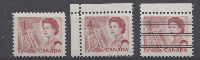
4c Carmine - Seaway Lock
This stamp is described by Unitrade as carmine. However, the deepest of these are really only half way between scarlet and carmine-red on the Gibbons colour key. The basic colour of the dex gum sheet stamps is really scarlet.
CBN Dex Gum Sheet Stamps

On the top row we have a Winnipeg tagged stamp on yellowish cream vertical wove with no distinct mesh and type 3 semi-gloss dex gum. The shade of this stamp is almost a perfect match to Gibbons's scarlet. The middle coil stamp on the top row is the exact same shade. This stamp is printed on yellowish cream coloured vertical wove with type 2 semi-gloss dex gum. The top right stamp above is printed on cream vertical wove, and has type 3 semi-gloss dex gum. The shade is still scarlet, but it is just a touch brighter than the scarlet of the other two stamps.
On the second row we have another example printed on cream vertical wove, this time with a slightly more visible horizontal mesh, and type 3 semi-gloss dex gum. The shade is also closest to scarlet on the Gibbons colour key, but the shade is slightly deeper than the above three stamps. The middle stamp is also printed on cream vertical wove with clear horizontal mesh and type 3 semi-gloss dex gum, but now the shade is acquiring a bit of carmine, being about half-way between scarlet and carmine-red. Finally, the bottom right stamp is closest to scarlet as well and is printed on cream vertical wove, with no visible mesh and streaky type 1 dex gum.
Lets take a closer look at these two rows:

These all look very similar, but with enough time spent looking at the shading around the "4", you should be able to see that the right stamp is somewhat brighter than the other two.
The difference is a bit harder to see in this scan, but if you compare these three stamps with the first three above, you will see the hint of carmine that is beginning to seep into the colour.
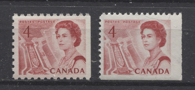
CBN PVA Gum Stamps
While there are some stamps with PVA gum that are very close in shade with some of the Dex gum stamps, most of the stamps with PVA gum are a much brighter version of scarlet, with many being either scarlet vermilion, or rosine on the Gibbons colour key.

On the top row we have a printing on white vertical wove paper, with eggshell PVA. The shade here is a slightly brighter version of scarlet. The other two stamps on the top row are both on white vertical wove, with eggshell PVA, one being untagged and one being Winnipeg tagged. These two stamps are brighter, and are closest to scarlet vermilion on the Gibbons colour key. Finally on the bottom row we have an example on white vertical wove with general Ottawa OP-2 tagging. This stamp is closest to a deeper version of Gibbons's rosine shade.
Let's take a closer look at these:

Although the colours look very similar at first, it should become apparent that the two stamps on the right are slightly lighter and brighter than the one on the left.

Booklet Stamps - CBN and BABN
The BABN booklet stamps are one of the shades that is closest to carmine, while the CBN booklet stamps are generally mostly scarlet shades, which are similar to the sheet stamps issued at the same time.
The BABN printed the 4c in two booklets, one being a $1 booklet of 25 stamps and the other being a 25c booklet of 4c + 1c stamps. The colour of the stamps in both booklets is very close to Gibbons's carmine red swatch, being just a little lighter. The stamp shown here comes from a 25c booklet, is printed on cream horizontal wove paper and has the type 1 high gloss dex gum. The CBN booklet stamp shown on the right is printed on cream horizontal wove paper with no mesh and has satin sheen dex gum. The colour of this stamp is closest to scarlet on Gibbons's colour key. This is consistent with my observation that the shades found on the CBN booklet stamps and CBN coil stamps generally mirrors those found on the dex gum sheet stamps.
This brings me to the end of my exploration of the shades on these first four values. I don't claim to have shown you all the shades that can be found, as I'm sure there are more. However, I am fairly confident that the range I have shown here covers what you will see 85-90% of the time that you work on these stamps. Then, every once in a while, you will luck out and come across something that you haven't seen before.
Next week, I will look at the shades on the 5c, 6c orange, 6c black and 7c emerald.
Thus, it is logical for me to tackle the issue of printing ink in eight posts: four dealing with variations between the inks in normal light, and another four to deal with variations under UV light. Today's post will look at the variations that are apparent under normal lighting conditions for the 1c, 2c, 3c and 4c. Then, over the next three weeks, I will look at the shades for the other values. Then after that, I will do the same thing, but looking at the differences under UV light. It is strange to me that no shade variations are listed in Unitrade for this issue. Although the differences between the colours of the stamps are generally subtle at first glance, once you become highly familiar with the stamps, you will begin to see that many of them look significantly different from one another. For the CBN printings. those stamps printed on paper with PVA gum tend to printed in colours which on the whole are both brighter and fresher than the earlier Dex gum printings, which are deeper and duller. The dex gum stamps on dead coated paper are the deepest of all, and it is this fact that provides some way to identify these printings, even when one does not have access to a UV lamp. The CBN booklet and cello paq stamps tend to exhibit many of the same shades found on the corresponding sheet stamps, but such is not the case with the BABN booklet stamps, which are often completely different colours from their sheet counterparts. The biggest discrepancies between booklet and sheet stamps occur on the 1c, 3c, 4c, and 5c booklet stamps, through it must be emphasized that the BABN did not print any of these stamps in sheet form, all that printing being done by the CBN. So, for those stamps, the point of comparison is between two printing firms. However, even with the 6c orange, 6c black, 7c emerald and 8c slate, there are colours on some of the sheet stamps that one does not find replicated in the booklet stamps and vice versa.
Shade variations can be found on virtually every value in the set, and the remainder of this post will look at each of these in turn.
1c Brown - Northern Lights and Dog Sled Team
The basic colour of this stamp varies, depending on whether or not it comes from a sheet or a booklet, and depending on who printed it.
CBN Sheet Stamps And Booklet Stamps
The basic colour of most of the CBN sheet stamps and booklet stamps is deep brown on the Stanley Gibbons colour key. The colour somewhat chocolaty without having either an overly reddish or purple undertone. Some of the early printings were also a very deep and slightly blackish brown, which is often thought of as purple brown, but actually isn't. However, by and large, the colour began to acquire more and more of a reddish undertone, so that by the time the general tagged PVA gum stamps appear from plate 5, the colour is a full-on red brown.
The following scan shows the basic range of shades found with the sheet stamps:

On the top row we have the basic shades of deep brown (all dex gum), with the blackish brown on the right, the pure deep brown on the left and a chocolate brown in the middle. The middle row shows three PVA gum printings that show the red-browns. The untagged and general Ottawa OP-2 tagged stamps on the left and right are a very close match to Gibbons's red-brown, while the centre Winnipeg tagged stamp is a close match to Gibbons' reddish brown. The bottom row shows two printings, one with dex gum on hibrite paper and one with General Ottawa OP-2 tagging and PVA gum. These two stamps have a brown that can best be described as being mid way between the colour palette of the top two rows. The left stamp is an exact match to Gibbons's chocolate, and is just a touch brighter than the centre stamp in the top row. The stamp on the right is similar to the Winnipeg tagged stamp above it, but there is just a little less red in it, and just a wee bit more brown. But if someone were to sort these quickly, they would probably miss the distinction and say that this, and the stamp above it were the same shade.
Now, let's take a closer look at each of these rows:

It is a little difficult to see the differences between the end stamps here, but the difference between these two and the centre stamp should be readily apparent. Pretty well all of the panes of 5 plus label of the 1c CBN printing that I have seen, will be one of these three shades.

Again, the end stamps should look quite similar here, and definitely reddish, while the centre stamp looks distinctly browner than the other two. I have not yet seen any booklet stamp printed in any of these shades. That is not to say that none exist, or existed, but just I haven't seen them.

In this scan these two stamps look similar, but if you let your eyes adjust, the one on the right has a purple undertone and is duller than the one on the left, which looks redder and browner by comparison.
Booklet Stamps - Nearly All BABN
The BABN booklet stamps are another range of shades entirely from the ones shown above. They are all closest to chocolate and purple-brown on the Gibbons colour key, with varying degrees of red, or purple in the colour. They lack the bright red of the reddish and red browns, and the blackish undertone of the deep brown. They are all somewhat dull in their appearance as well. I have not seen any of these shades replicated in the sheet stamps.
The following scan shows a range of BABN booklet stamps, with a CBN booklet stamp on the right side of the upper row for comparison. The CBN stamp is the basic deep brown, and it highlights how different the BABN shades are from the CBN ones. Let's take a look at them:

On the bottom row, the perf 10 stamp with label, which has the type 2 lower gloss, satin dex gum, which comes from the 25c booklets is almost a perfect match to Gibbons' purple brown. Finally, the perf. 12.5 x 12 1c on the right, which is on ribbed paper with cream eggshell PVA, which comes from the 25c booklets from 1971, is a very close match to the perf 10 stamp on the first row above.
This is a complex colour due to the overlap found between the CBN stamps with dex gum and those with PVA gum. Generally speaking, most of the dex gum stamps will be found in shades that are all variations of Gibbons's myrtle green, though there will be some brighter greens as well. The PVA gum stamps show considerable variation from shades of deep green to shades of emerald or yellowish green. Finally, the OPAL booklet stamp, which is the only booklet stamp, and was printed by the CBN with dex gum is usually found in a shade of deep green, similar to many of the PVA gum stamps, and quite a bit brighter than the greens found on the dex gum stamps.
Dex Gum Sheet Stamps - All CBN

On the top row at the very far right we have an exact match to Gibbons's myrtle green, and on the bottom left an almost exact match for Gibbons's deep grey green. These two colours are usually what you will see on most of the dex gum sheet stamps. The other two stamps on the top row are also myrtle green, but are not exact matches to the Gibbons myrtle green swatch. The stamp at the top left is just a bit yellower, while the stamp in the middle is the same tone, but is brighter. The stamp on the bottom right is another variation of the myrtle green, being the most yellowish and brightest. This stamp is printed on a very distinct, fibrous, rough vertical wove paper that shows no distinct mesh. It is very distinct from all the others.
Let's take a close look at each of these rows:

The difference between these three stamps is very subtle and not readily apparent from this scan.

Here, the difference between these two colours should be quite obvious. I find that a good part of the design to focus my eyes on when I am sorting shades is the shoreline at the lower left of the design.
PVA Gum Stamps - Again, All CBN
The PVA gum stamps generally lose the undertone of grey or blue that many of the dex gum stamps had.

On the top row at the left we have a printing on the white, horizontal ribbed paper, and to its right, a printing on smooth paper. Both of these are printed in very similar shades, with the left stamp being only every so slightly darker than the right. But the difference is so small, that you could classify these two stamps as being the same shade. These are both an nearly exact match to Gibbons's myrtle green. The stamp at the top right is on smooth vertically wove paper and is closest to Gibbons's green. On the bottom row we have two printings with general Ottawa OP-2 tagging, each in a different shade and a different paper. The stamp on the left is on cream, vertical wove, horizontal ribbed paper and is almost an exact match to Gibbons's deep green. The stamp on the right is a very close match in shade, but is just a bit brighter, and is printed on a similar ribbed paper that is white, instead of cream.
So generally, while some of the PVA gum stamps are myrtle green, most are either green, or deep green. Let's take a closer look at the two rows above:

Here you should clearly be able to see how the stamp on the right is brighter and more yellowish than the other two myrtle green stamps.

Apart from the shades, these two stamps provide an excellent example of how two papers that list as being identical in Unitrade, can be so different in their appearance.
OPAL Booklet Stamp

Even though this stamp was ostensibly printed by the CBN, it looks completely different to the sheet stamps, for reasons that remain a mystery. The colour is quite similar to the above two deep green stamps, but is just a touch brighter.
3c Purple - Prairies and Oil Rig
The sheet stamps were all printed by CBN, and the colours of these are all generally shades of lilac, which vary mostly in terms of how much red they contain. Surprisingly, Unitrade does list a red-violet shade, being one of the few shades listed, and it is indeed a very reddish version of the basic colour. However, as prominent as it is, I do not think that it is any more remarkable than many of the shade varieties that are to be found on many of the other values. The booklet stamps were either printed by BABN or the CBN in the OPAL booklet. The colours of both classes of booklet stamp are completely different from the sheet stamps, and are completely different from one another.
Dex Gum Sheet Stamps and Coils - All CBN

Let's take a closer look at these two rows:

Here the differences are best seen by concentrating on the uncut grain at the bottom left corner of the design. If you focus on that you can clearly see that the middle stamp is a much redder shade than the other two stamps, which contain a brownish undertone.

PVA Gum Precancelled Stamp - CBN

This is an interesting stamp in the sense that it is the only way that the sheet 3c comes with PVA gum, and it is the only printing of the 3c to exist with general Ottawa OP-2 tagging. On the Gibbons colour key, it is almost an exact match to blackish purple.
Booklet Stamps - Both BABN and CBN
The 3c was printed once by the CBN for inclusion in the 1970 OPAL vending machine booklets, and then was incorporated into the large $1 booklet with dex gum and the 25c booklets with PVA gum.

The colour of this stamp varies
4c Carmine - Seaway Lock
This stamp is described by Unitrade as carmine. However, the deepest of these are really only half way between scarlet and carmine-red on the Gibbons colour key. The basic colour of the dex gum sheet stamps is really scarlet.
CBN Dex Gum Sheet Stamps

On the top row we have a Winnipeg tagged stamp on yellowish cream vertical wove with no distinct mesh and type 3 semi-gloss dex gum. The shade of this stamp is almost a perfect match to Gibbons's scarlet. The middle coil stamp on the top row is the exact same shade. This stamp is printed on yellowish cream coloured vertical wove with type 2 semi-gloss dex gum. The top right stamp above is printed on cream vertical wove, and has type 3 semi-gloss dex gum. The shade is still scarlet, but it is just a touch brighter than the scarlet of the other two stamps.
On the second row we have another example printed on cream vertical wove, this time with a slightly more visible horizontal mesh, and type 3 semi-gloss dex gum. The shade is also closest to scarlet on the Gibbons colour key, but the shade is slightly deeper than the above three stamps. The middle stamp is also printed on cream vertical wove with clear horizontal mesh and type 3 semi-gloss dex gum, but now the shade is acquiring a bit of carmine, being about half-way between scarlet and carmine-red. Finally, the bottom right stamp is closest to scarlet as well and is printed on cream vertical wove, with no visible mesh and streaky type 1 dex gum.
Lets take a closer look at these two rows:

These all look very similar, but with enough time spent looking at the shading around the "4", you should be able to see that the right stamp is somewhat brighter than the other two.

CBN PVA Gum Stamps
While there are some stamps with PVA gum that are very close in shade with some of the Dex gum stamps, most of the stamps with PVA gum are a much brighter version of scarlet, with many being either scarlet vermilion, or rosine on the Gibbons colour key.

On the top row we have a printing on white vertical wove paper, with eggshell PVA. The shade here is a slightly brighter version of scarlet. The other two stamps on the top row are both on white vertical wove, with eggshell PVA, one being untagged and one being Winnipeg tagged. These two stamps are brighter, and are closest to scarlet vermilion on the Gibbons colour key. Finally on the bottom row we have an example on white vertical wove with general Ottawa OP-2 tagging. This stamp is closest to a deeper version of Gibbons's rosine shade.
Let's take a closer look at these:

Although the colours look very similar at first, it should become apparent that the two stamps on the right are slightly lighter and brighter than the one on the left.

And this is the rosiest and brightest of the bunch, but does not contain any hint of vermilion in the colour. Indeed, this colour is about as far away from carmine as you can get while still being a red stamp.
Booklet Stamps - CBN and BABN
The BABN booklet stamps are one of the shades that is closest to carmine, while the CBN booklet stamps are generally mostly scarlet shades, which are similar to the sheet stamps issued at the same time.

This brings me to the end of my exploration of the shades on these first four values. I don't claim to have shown you all the shades that can be found, as I'm sure there are more. However, I am fairly confident that the range I have shown here covers what you will see 85-90% of the time that you work on these stamps. Then, every once in a while, you will luck out and come across something that you haven't seen before.
Next week, I will look at the shades on the 5c, 6c orange, 6c black and 7c emerald.

Comments
Post a Comment