Plate Characteristics and Plate Flaws on the 1967-1973 Centennial Issue
Today, I will start my discussion of the final, physical characteristic of the stamps from this issue: the plate characteristics and flaws. Today's post will be an overview of the different plate characteristics and flaws, followed by a detailed discussion of plate characteristics. Then I will deal with the specifics of plate flaws in more detail through some additional posts over the next few weeks.
At the broadest level there are three aspects of interest: plate characteristics, freaks and plate flaws. Plate characteristics are those properties of the printing itself that are intentional and by design. They are, consequently generally present on every stamp in the print run, and distinguish one printing from another, or one group of printings from another. Plate flaws on the other hand are anomalies in the stamp design that occur on a limited number of stamps in each sheet. Those which occur randomly in the printing are dubbed "non-constant", while those that occur on every sheet in the exact same position are called "constant plate flaws".
Freaks, which by their nature are random and thus difficult to document completely are those anomalies which are caused by mishaps in the actual printing. This is a topic for an entirely separate post, and will be addressed as such.
There are several different classes of plate flaws to be found on this issue, each of which is interesting for different reasons. Some of these are quite major, very scarce and eagerly sought after, while some are quite minor, and worth only a small premium over the price of a normal stamp.
Plate Characteristics - Die Type Differences
The most famous of the different plate characteristics which are widely known to Canada collectors are the die 1, die 2 and die 1a of the 6c black transportation. The dies are distinguished by differences in the depth of the engraving and strength of the shading lines. They are so prominent and notable that separate catalogue numbers have been assigned to them (or at least major variety status). These differences are detailed in the catalogues largely because several printings of the 6c that have the same paper, perforation or gum, differ only in terms of these die types, and so it becomes necessary to be familiar with them to sort the stamps.
The differences between the three dies are illustrated in the scans below:
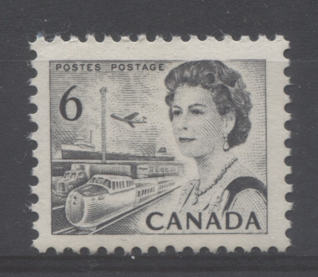
On the die 1 stamps, the horizontal shading lines in the sky are uneven and weak. The framelines at the right and left are thin.


Die 1a, also known as "the CBN die" is mid-way between these two extremes. On the one hand, the framelines at the sides are thin, just like the BABN die 1. However, the shading in the sky is full and even as with die 2, but is not as dark.
These differences are the ones that are identified specifically in stamp albums and in the catalogue. However, there are other instances in this issue where the die characteristics of the stamps differed notably from the standard Canadian Bank Note Company (CBN) printings, that are not discussed explicitly in the specialist literature, but should be (at least in my opinion):

Here is the normal design of the CBN printed sheet stamp. The strength of the printing does vary slightly with some of the later printings being somewhat weaker, across the entire design. But there are several characteristics to note:


Here is the CBN printing of the 3c sheet stamp. As with most of the CBN sheet stamps, the shading on the neck is of uneven strength, and the shading on the face is of uniform strength. The detail of the hair is visible, with some, but not many highlights. The impression overall has a fine appearance.


Here is a CBN printing of the 5c blue. Generally speaking the shading in the sky is quite light, and is of moderate strength. Again, the overall printing impression appears fine.


Even though the engraving appears to be of almost uniform depth, there is still plenty of white in the design to give it depth and contrast.


Here is a typical BABN sheet stamp showing the characteristic even-depth engraving, fine vertical lines and thick right hand frameline that is characteristic of this value.


At the broadest level there are three aspects of interest: plate characteristics, freaks and plate flaws. Plate characteristics are those properties of the printing itself that are intentional and by design. They are, consequently generally present on every stamp in the print run, and distinguish one printing from another, or one group of printings from another. Plate flaws on the other hand are anomalies in the stamp design that occur on a limited number of stamps in each sheet. Those which occur randomly in the printing are dubbed "non-constant", while those that occur on every sheet in the exact same position are called "constant plate flaws".
Freaks, which by their nature are random and thus difficult to document completely are those anomalies which are caused by mishaps in the actual printing. This is a topic for an entirely separate post, and will be addressed as such.
There are several different classes of plate flaws to be found on this issue, each of which is interesting for different reasons. Some of these are quite major, very scarce and eagerly sought after, while some are quite minor, and worth only a small premium over the price of a normal stamp.
Plate Characteristics - Die Type Differences
The most famous of the different plate characteristics which are widely known to Canada collectors are the die 1, die 2 and die 1a of the 6c black transportation. The dies are distinguished by differences in the depth of the engraving and strength of the shading lines. They are so prominent and notable that separate catalogue numbers have been assigned to them (or at least major variety status). These differences are detailed in the catalogues largely because several printings of the 6c that have the same paper, perforation or gum, differ only in terms of these die types, and so it becomes necessary to be familiar with them to sort the stamps.
The differences between the three dies are illustrated in the scans below:

On the die 1 stamps, the horizontal shading lines in the sky are uneven and weak. The framelines at the right and left are thin.

On die 2, the most noticeable difference is the shading in the sky which is full and even. On some stamps it is darker than on others, but the evenness of the lines is key. The other thing is that the framelines at the sides have been recut making them thicker and stronger.

These differences are the ones that are identified specifically in stamp albums and in the catalogue. However, there are other instances in this issue where the die characteristics of the stamps differed notably from the standard Canadian Bank Note Company (CBN) printings, that are not discussed explicitly in the specialist literature, but should be (at least in my opinion):
- The BABN printings of the 1c, 3c, 4c and 5c stamps that were issued in booklet form.
- The 2c and 3c stamps from the OPAL booklet.
- The 7c transportation as compared to the 6c values.
- The 6c orange perf. 10 sheet stamps, booklet stamps and coil stamp compared to the perf. 12.5 x 12 stamps.
- The 7c coil versus the sheet stamps (CBN versus BABN)
- The 8c coil versus the sheet stamps (CBN versus BABN)
BABN Printings of Sheet Stamps That Were Normally Printed by CBN
1c Brown - Northern Lights and Dogsled Team

Here is the normal design of the CBN printed sheet stamp. The strength of the printing does vary slightly with some of the later printings being somewhat weaker, across the entire design. But there are several characteristics to note:
- The lines of the Queen's hair are clearly defined, but there are not many contrasting highlights in the hair itself.
- The Queen's eyebrows are full and evenly shaded.
- The shading lines on the cheek are weak.
- The detail in the shading of the dogs is complete and in the sled: the pack is clearly visible, as are both feet of the sled. You can usually see the face of the eskimo.
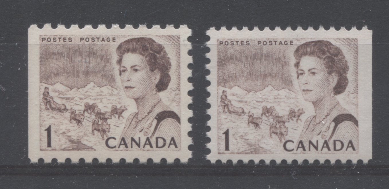
In contrast, we have two examples of the 1c booklet stamp printed by BABN. The entire design appears coarser, but there are several details which they have in common, and which differ from the CBN sheet stamps:
- The lines of the Queen's hair are clearly defined, and there are many highlights that make the detail stand out.
- The Queen's eyebrows are fullest toward the centre of the forehead and become weaker as they extend toward the temples.
- The shading lines on the cheek are stronger.
- The detail in the shading of the dogs is much weaker, as well as in the sled: the pack is much less clear, and you have to look more closely to see both feet of the sled. The detail of the eskimo's face is often not visible at all.
3c Violet - Combine Harvester and Oil Rig

Here is the CBN printing of the 3c sheet stamp. As with most of the CBN sheet stamps, the shading on the neck is of uneven strength, and the shading on the face is of uniform strength. The detail of the hair is visible, with some, but not many highlights. The impression overall has a fine appearance.

Here is the BABN booklet stamp. Unlike the CBN printing, the overall impression appears coarse. However, in addition, the shading in the neck and face is not even, and on the cheek, it is strongest, the closer you get to the Queen's eyes, and on the neck it is strongest over the throat.
4c Carmine Rose - Seaway Lock

Here is the CBN printing of the 4c carmine rose, The characteristics of the Queen's portrait are similar to the 1c, except that the hair contains more highlights. The shading lines in the rest of the design are full and unbroken, especially the water.

Here is the BABN printing from the booklets. There is not much if any difference in the appearance of the Queen's portrait, but the shading lines on the water, and portions of the lock appear of uneven strength.
5c Deep Blue - Atlantic Fishing Village

Here is a CBN printing of the 5c blue. Generally speaking the shading in the sky is quite light, and is of moderate strength. Again, the overall printing impression appears fine.

Here is the BABN printing from the $1.00 booklet that was issued in 1968. As is common for the BABN printings, the impression overall appears much coarser than the CBN stamps. The shading on the neck, sleeve, sternum, neck and face is also much stronger than on the CBN stamps.
The 2c and 3c OPAL Booklet Stamps Versus The Regular Sheet Stamps
All of the 2c stamps were printed by CBN. Yet, there are some marked differences between the regular sheet stamp and the 2c stamp that comes from the OPAL booklet. The 3c stamps were printed by the CBN and BABN, but like the 2c, there are major differences between the OPAL booklet stamp and the regular CBN sheet stamp.

Here is an example of one of the later CBN printings with PVA gum on ribbed paper. As you can see there are some highlights in the Queen's hair, and the shading on the face and neck is uneven, while being quite weak on the sleeve. This is a characteristic that seems to be limited to these later printings, because the earlier CBN printings show much stronger and more even shading.

Here is a 2c from the OPAL booklet. What immediately stands out is the amount of white highlights in the Queen's hair. followed by the coarse appearance of the shading on the Queen's face and neck. If you look at the rest of the design, it just seems that all the details are more even, but at the same time, the entire design has a coarse appearance.
Here is the CBN printing of the 3c sheet stamp. As with most of the CBN sheet stamps, the shading on the neck is of uneven strength, and the shading on the face is of uniform strength. The detail of the hair is visible, with some, but not many highlights. The impression overall has a fine appearance.

Here is the OPAL booklet stamp, which despite the fact that it was also printed by the CBN, appears coarser overall compared to the sheet stamp. What is most noticeable is that there is much more white in the hair, the shading of the face and neck is more even looking, but at the same time it has a coarse appearance.
The 7c Transportation Versus The Regular 6c Sheet Stamp
The 7c transportation at first glance appears to be the same design as the 6c. However, the die of the 6c has been altered by adding a network of fine vertical lines that run through the entirety of the design. These have the effect of taking away the appearance of depth in the engraving and make the design appear almost "flat". There is also no white space on the design at all.
Compare the die 2 6c black with the 7c sheet stamps shown below to see what I mean:

Even though the engraving appears to be of almost uniform depth, there is still plenty of white in the design to give it depth and contrast.

Here, all the white is gone, and with it all the contrast that gives the design depth. Notice the fine network of vertical lines that run through the design. Notice also the thick framelines at the sides, which suggest that the 7c die was made by altering the second die of the 6c black.
The 6c Orange Coil and Perf. 10 Stamps Versus the Perf. 12.5 x 12 Sheet Stamps

Here is an example of a typical perf. 10 sheet stamp of the 6c orange. While the overall depth of the engraving in the impression appears more of less even, there are nonetheless some weak points along the framelines, and in some of the finer horizontal shading lines.

Here is an example of the 6c orange perf. 10, taken from a 25c booklet, issued in 1968. What is notable here is that the design is more or less evenly printed, with the shading lines and framelines being full, clear and crisp. The design does not have the weak points that the sheet stamps have. It is closest to the die 1a of the 6c that was printed by CBN.

The overall printing impression of the perf. 12.5 x 12 sheet stamps is weaker than the perf. 10's, but is not as weak as the die 1 6c black stamps. The right frameline is thin, as it is for all of the BABN stamps, but the upper and lower framelines tend to be quite weak.
That is the BABN sheet and booklet stamps. But what about the coil stamp that was printed by CBN? Let's take a look at that next:

The appearance of this stamp is quite similar to the perf. 10 sheet stamps, but with this CBN printing, the depth of the engraving is even across the entire design, with no "weak spots". The right frameline is still thin, as it is for the other 6c orange stamps.
The 7c Coil Versus the Sheet Stamps
The 7c value was printed primarily by the BABN, which printed the sheet stamps and all the booklet stamps. However, the coil stamps were printed by CBN, using the same plates. Given the differences between the BABN printed and CBN printed stamps that we have seen so far, we would expect to find similar differences on this value. However, such is not the case. This is actually one of the few stamps from the series that exhibits almost no difference, in appearance, between the BABN and CBN printings:

Here is a typical BABN sheet stamp showing the characteristic even-depth engraving, fine vertical lines and thick right hand frameline that is characteristic of this value.

Here is an example of the CBN coil. As you can see, there is virtually no difference in the overall appearance of the stamp, except for the colour: there is less blue in the green of the CBN stamp.
The 8c Coil Versus the Booklet and Sheet Stamps
This is another value in the set that was printed primarily by the BABN, but for which coil stamps were printed by the CBN. Like the 7c stamp, there are very few, if any discernible differences between the sheet stamps, booklet stamps and coil stamps, even though different firms printed them:

Here we have one of the typical sheet stamps. On this value, there is quite a bit of white highlights in the Queen's hair, and the shading has an even appearance on both the face and the neck. There are some weak spots in the shading surrounding the library.

Here is one of the booklet stamps. Apart from the shade, which contains more blue and less grey, there is really not much difference at all between the appearance of the booklet stamps and the sheet stamps.

Here is a coil. The coils do appear different from the sheet and booklet stamps, but that is mostly because of colour and not the plate characteristics. There is a slight strengthening of the shading immediately around the library, but the difference is not that significant.
Plate Flaws
As I explained above, there are many, many different classes of plate flaws that can be found on the stamps of this issue:
- Constant plate flaws found on certain booklet and sheet stamps.
- Cylinder flaws that are also constant, but numerous and minor in nature.
- The "totem pole eyes" on many of the 2c stamps, which occur at selected positions on different panes within the sheet of 600 stamps.
- Plastic flow varieties, which result in doubling of certain parts of the design on some stamps. These have a similar appearance to re-entries, but are less sharp, and have a different origin.
- Ink drag flaws, some of which are listed, like the "extended line from lobster trap" and some of which are not.
The remainder of this post will look at the cylinder flaws, ink drag flaws and plastic flow varieties in detail. The other constant plate flaws will be discussed in a separate post, as will the totem pole eyes on the 2c.
Constant Plate Flaws
There are several constant flaws documented on the stamps of this issue, many of which are surprisingly scarce and hard to come by. These are generally all listed in Unitrade, though some are not. Next week's post will discuss these in more detail, including providing as many illustrations as I can for them. However, for now, I will simply mention what they are:
- The "airplane in the sky" variety on the 1c BABN booklet stamp perf. 12.5 x 12.
- The "line through 5" on the 5c sheet stamp, which comes from position 11 on plate 3.
- The broken necklace on the 5c BABN booklet stamp.
- The "doubled C" on the 6c orange perf. 10, which comes from position 10.
- The "extra spire" variety on the 8c parliament, which comes from plate 4.
- The "scratch on forehead" variety on the 8c parliament, which comes from one of the later plates.
Cylinder Flaws
On the sheet stamps printed by the BABN, there are a lot of very minor flyspeck varieties that can be found. Most consist of extra dots where there should not be any, or specks of colour in the margins and so forth. They are of interest because prominent collectors of Centennials over the years have been able to show that they are constant in nature, and are not merely random occurrences:
- Over 100 varieties are known on the 6c orange.
- 86 varieties are known on the 7c emerald green.
- 75 varieties are known on the 8c parliament.
An excellent discussion of these flaws and extensive illustrations of them can be found in Robin Harris's book on this issue. Here he describes, illustrates and prices most, if not all of them. Unfortunately I do not have an example of one handy, but I will add an image of a typical flyspeck flaw when I come across it.
Totem Pole Eyes on the 2c Green
If you look closely at the 2c design, you will notice that the figures on the totem pole have 4 eyes in total. These eyes normally consist of a large green dot, surrounded by a green circle that is very close to the dot. This is what is termed the "closed eye". The normal appearance of the design is for all four of the eyes to appear closed in this way. However, there are instances in which the large green dot is either not fully printed, or is completely missing on one of more of the eyes. A total of 33 different combinations of open and closed eyes have been found on this stamp. I will detail many of them in a subsequent post. But for now, you should be aware that they exist, and that they are generally worth a good premium over the price of the normal stamps (i.e. in the $2-$5 range per stamp).

Here is the regular appearance of the totem pole. Notice how the centre of each eye is a solid dot of colour and there is a complete circle around each eye.

Here is one variation in which the only eye that is full and closed is the lower right one. The lower left eye has a crescent inside it, so is partially open. The upper right eye is the same, except the crescent is much larger. Finally, though it is harder to see, the upper left eye has the full dot, but it is hollow in the centre.

Here, all eyes except the upper left one are closed. The upper left eye is almost completely open, having just the smallest crescent of colour inside it.
In a subsequent post I will attempt to describe and illustrate as many of the 33 different variations as I can find. But for now, this gives you some idea of what the differences look like.
Plastic Flow Varieties
The plates for this issue were made of plastic, rather than steel. When the plates were being molded, in some instances additional plastic flowed into areas where it shouldn't, and the result was partial doubling of the design. In all cases that had been discovered so far, this has affected the numerals only, but in theory any part of the design could have been affected in this way. The values on which these varieties have been found so far are:
- 6c black die 2
- 8c Alaska Highway
- 15c Bylot Island
- 25c Solemn land on hibrite paper only
The scan below shows a strong example of this variety on the 8c Alaska Highway:

If you look closely you can see slight doubling of the left side of the "8" and of the inside loops of the "8" on the right side. The doubling manifests itself in the form of curved lines inside the numeral and bordering the outside. The difference is readily apparent if you compare the above to a normal stamp where the "8" shows no doubling at all:

Notice how there is absolutely no curved line inside either loop of the "8", nor is there any curved line bordering the left side of the "8". There is no sign of any doubling whatsoever.
The variety has a similar appearance on the 6c, 15c and 25c, though I have yet to see an example of the 25c with this variety. However, I have no reason to think that it would appear significantly different from the variety shown here.
Ink Drag Flaws
The BABN printings of these stamps were prepared using printing cylinders rather than flat plates. Quite frequently the high speed rotation of the cylinders would produce extended framelines on stamps, or "whiskers" of colour on the stamp designs that were not supposed to be there. These occur most frequently on the 6c orange perf. 12.5 x 12 and the 8c parliament. The most well known of these though, as well as the only one to be listed in Unitrade is the "extended lobster trap", which consists of a very small extension of the top line of the lobster trap into the margin.
The scan below shows an example of a common ink drag flaw on the 6c orange transportation perf. 10:

You can see the flaw in the lower right corner, where the horizontal frameline extends into the margin:

This concludes my discussion of the different die type differences on this issue and my broad overview of plate flaws. Next week I will discuss the constant plate flaws that are found on some of the booklet stamps and sheet stamps, and then the following week, I will discuss the totem pole eye varieties on the 2c in greater depth.

Comments
Post a Comment